Visualization
Visualization is the core Columns experience. We continuously improve it to make analysis faster and storytelling clearer.
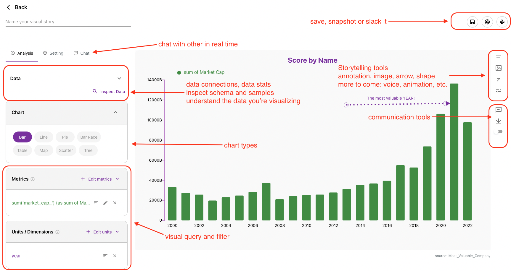
Visualizer Anatomy
The visualizer is where you analyze a dataset and build a chart. It has four main parts:
- Visual query (right): define dimensions, metrics, filters, and field settings.
- Visual canvas (left): render results and interactively style chart elements.
- Storytelling tools: adjust highlights, contrast, annotation, and presentation details.
- Communication tools: share links, post to Slack, download assets, and create stories/apps.
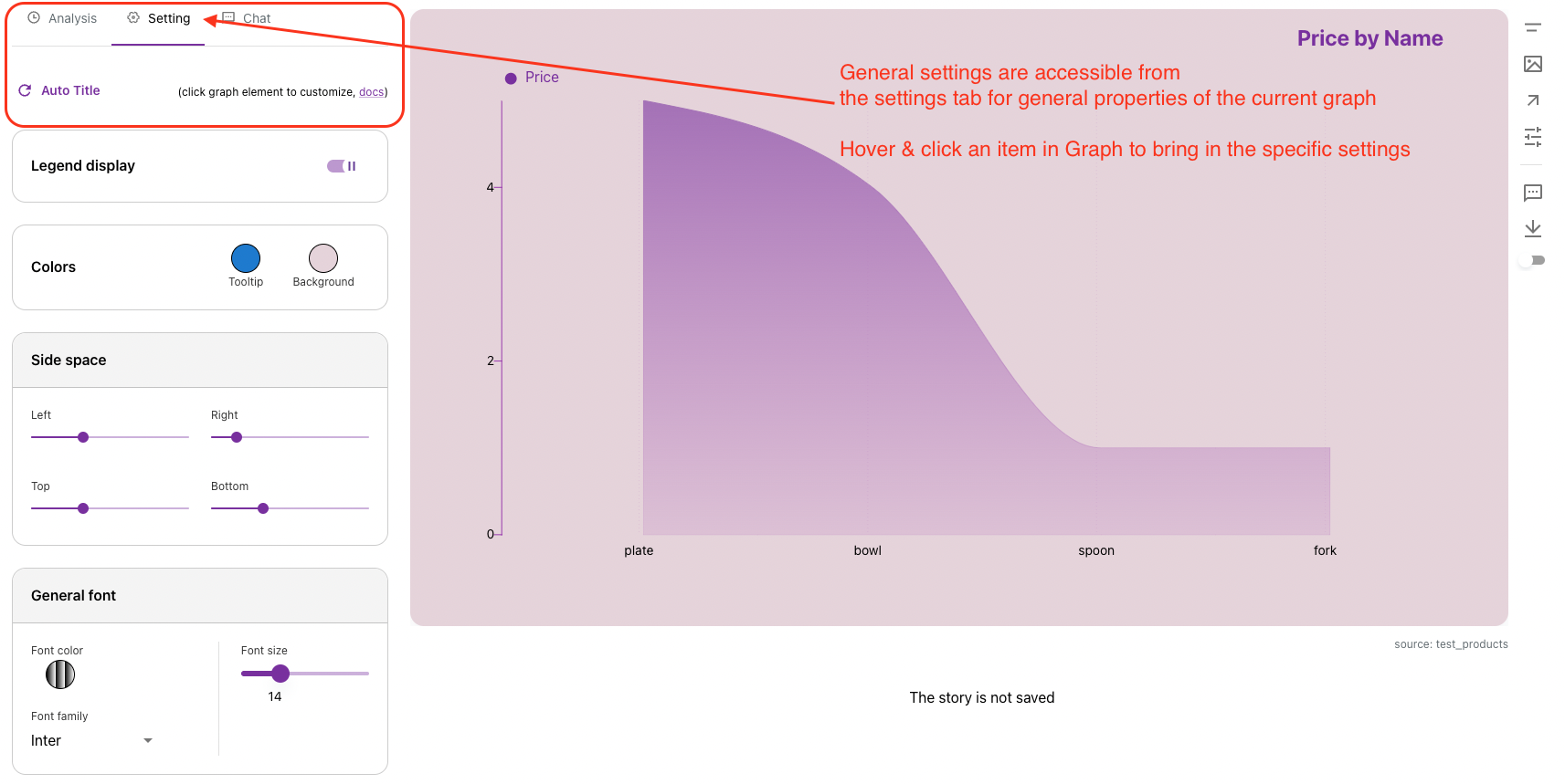
Settings Panel
Almost any item on the canvas is clickable and customizable. For example, you can highlight a specific bar or bar group.
Example:
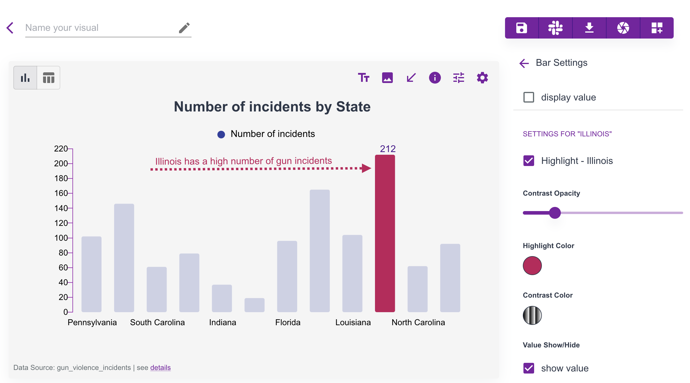
To customize the full graph, click the general settings icon.
Visual Gallery
You can save each visual to your gallery. Saved visuals can be reused for sharing, embedding, and story building.
Share a visual
Sharing creates a link that can be public or passcode-protected.
You can toggle sharing from the Share action in each visual.
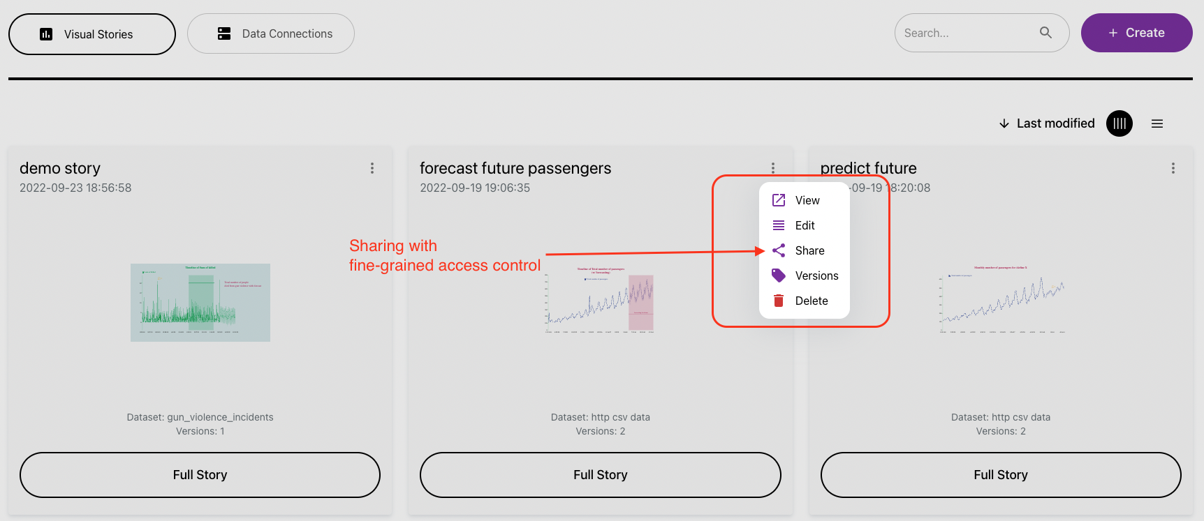
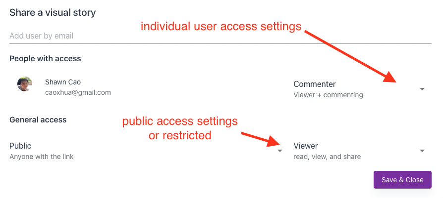
There are three sharing levels:
restricted: only specific invited users can accessteam: only members of your Columns team can accesspublic: anyone with the link can access
Access scope controls permissions: view, comment, or edit.
Embed a visual
After sharing, you get a unique visual URL. You can distribute that URL or copy embed code to place the visual on your own site.
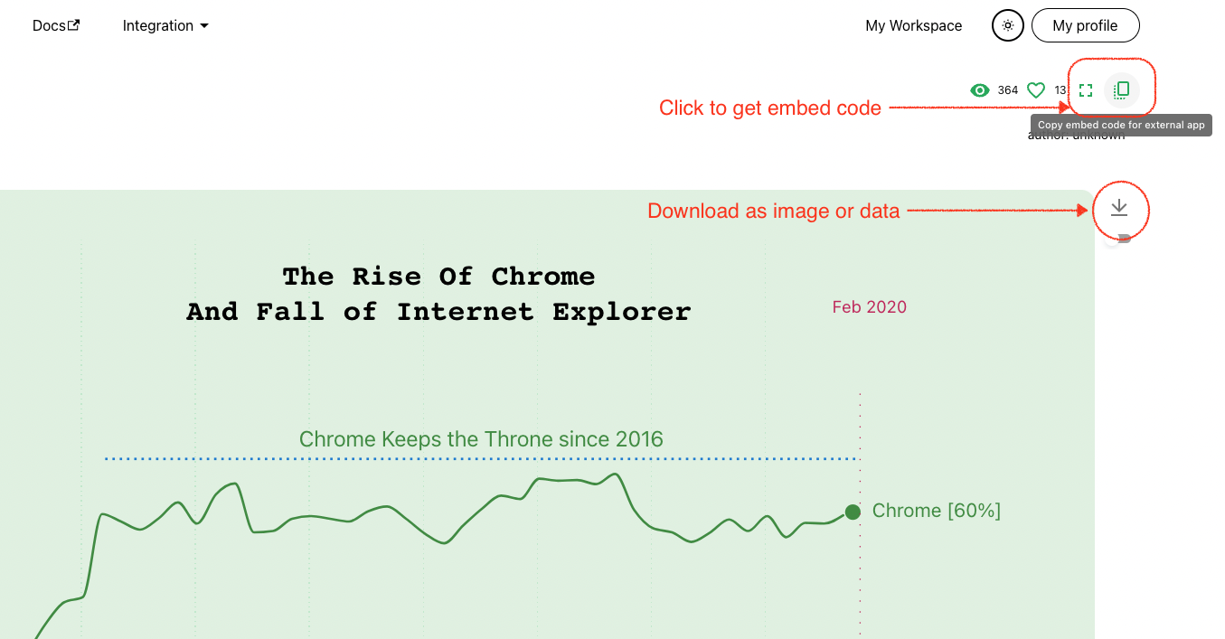
For public websites, set sharing level to public so viewers can access the embedded content.
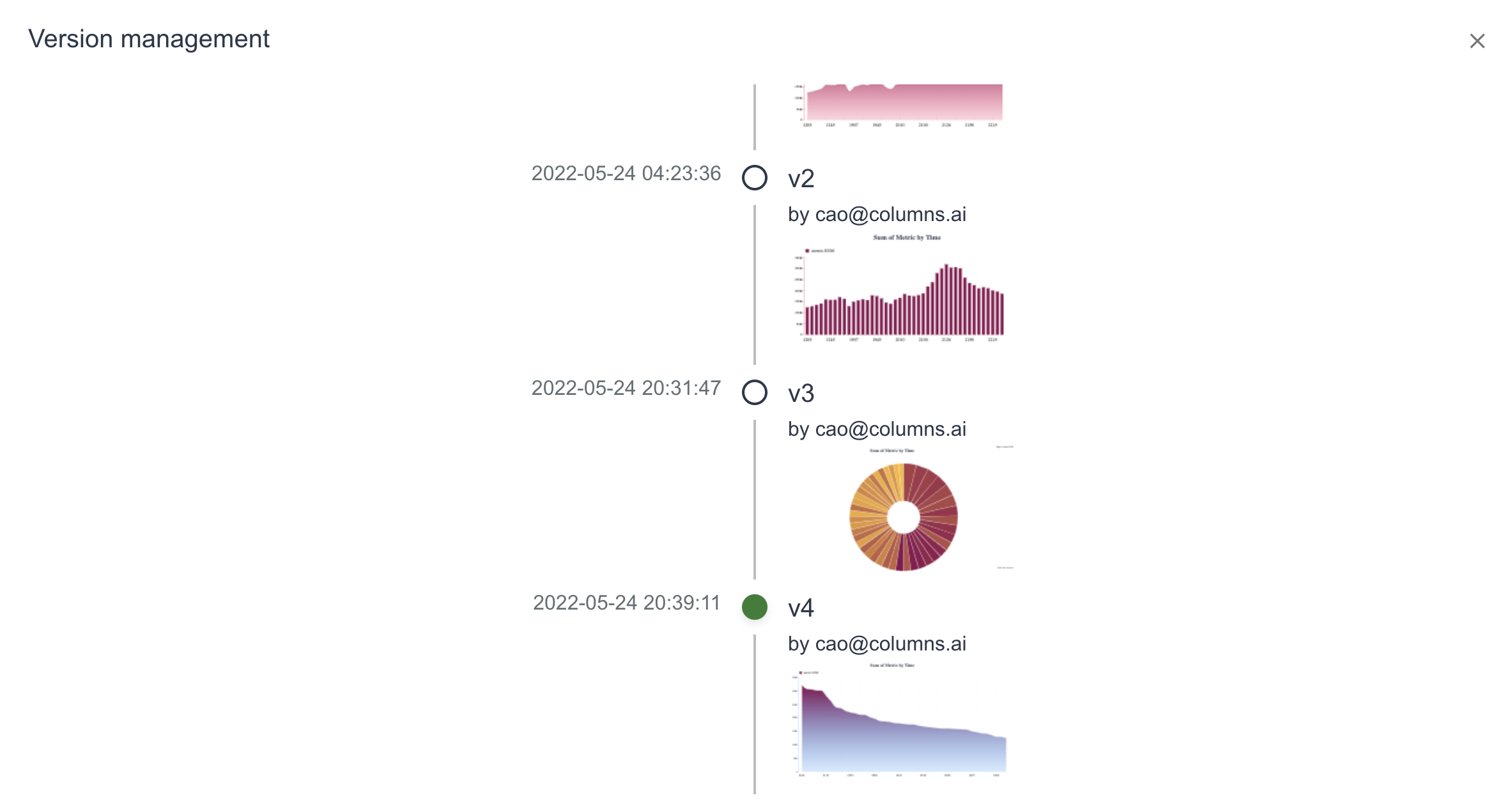
Version control
Each visual supports multiple saved versions. This is useful when teams collaborate in a shared workspace and need to iterate safely. In version control UI, you can select and set a default version.
Example: