Customization
Customization is a core concept in Columns. Unlike many visualization tools, Columns does not stop at chart rendering. It gives you tools to shape narrative and communicate impact.
There are three major storytelling tool categories in Columns:
- Chart customization
- Visual design
- Presentation craft
Chart Customization
As shown in the visualization guide, chart-level settings can make a visual more expressive. Color scheme, contrast, and highlighting are effective ways to focus attention.
We continue adding chart-specific controls to provide more customization depth.
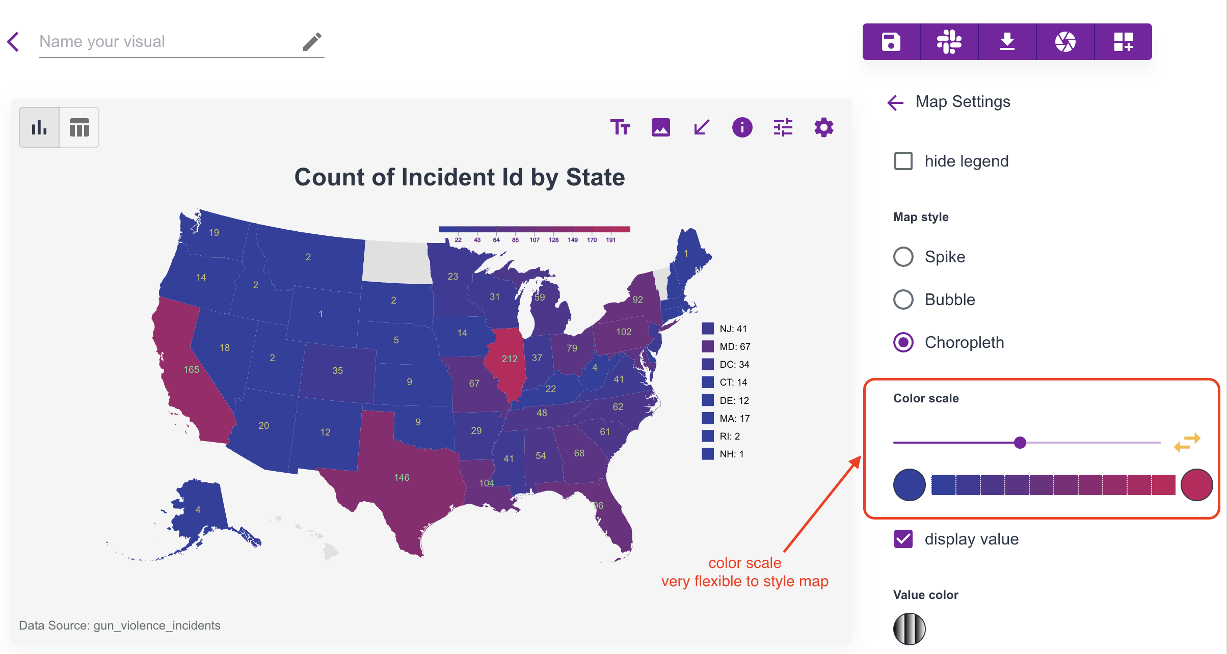
General tip: click chart elements directly on the canvas. Contextual settings appear based on what you selected. For maps, map type and color scale are especially useful controls.
Visual Design
Columns provides practical design tools for storytelling:
- annotation
- images
- icons
- arrows
- shapes
Example:
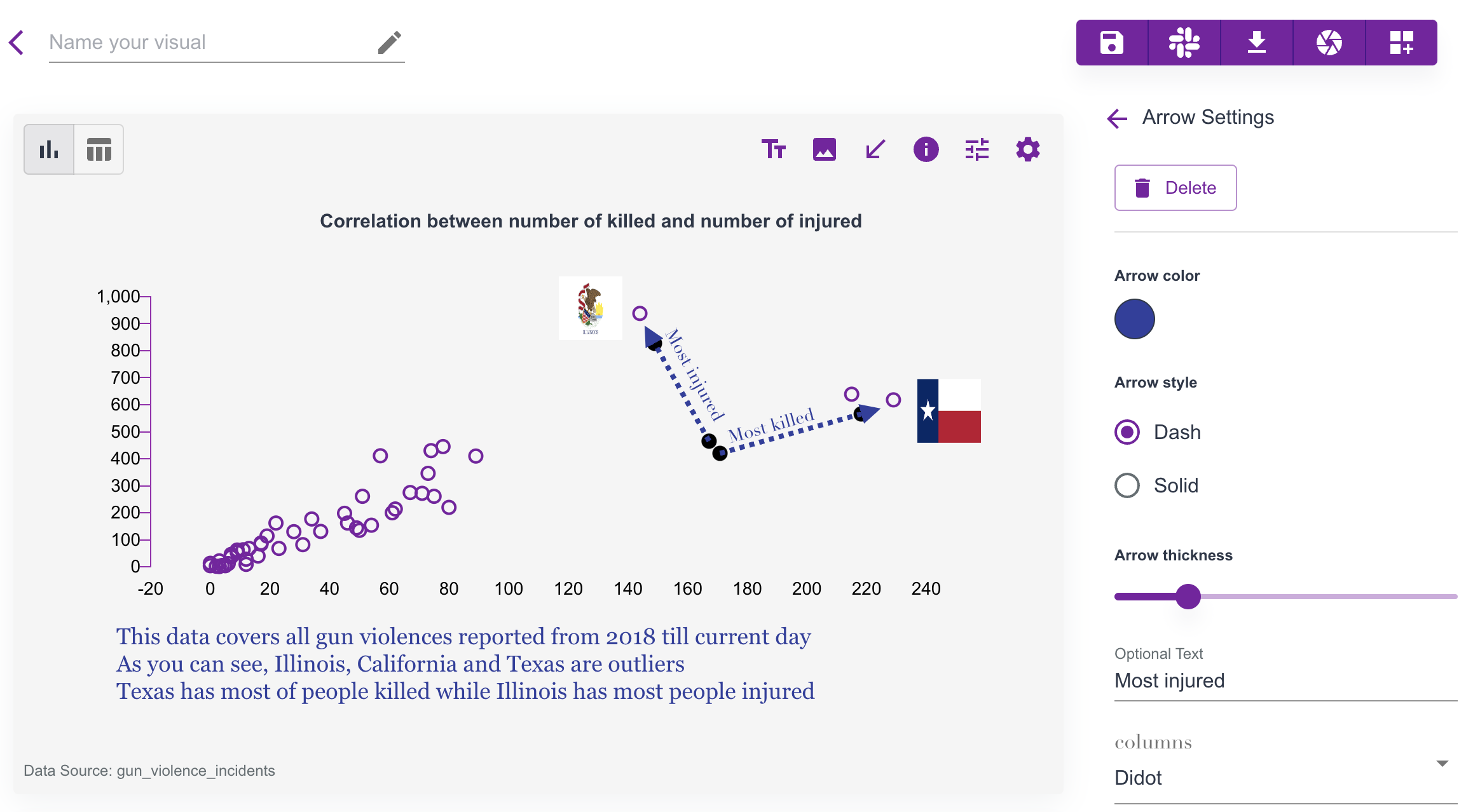 In this example:
- scatter chart spacing is adjusted
- multi-line annotations add context
- highlighted state images add focus
- arrows explain key points
- title and color styling improve readability
Customization
Columns provides a canvas where you can customize nearly every visual element. If you are unsure where to start, hover and click elements to open dynamic settings.
For example, to customize axis Value Range, click the axis directly and update the range settings.
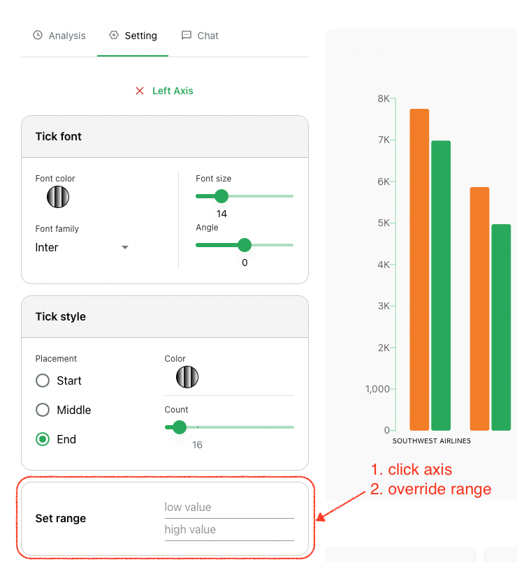
Remember: most canvas elements are customizable, so explore by clicking around the chart.