Columns AI, a fast-rising platform in the data visualization space, has earned a prestigious spot among top business software solutions, as recognized by Research.com.
This endorsement places Columns AI in the company of elite tools that help professionals work more efficiently, communicate better, and drive informed decisions with clarity and confidence. The recognition affirms Columns AI’s growing influence in the field of data storytelling, where speed, design, and accessibility are transforming how teams operate.
Known for its rigorous evaluation process and emphasis on real-world value, Research.com highlights only those platforms that demonstrate practical innovation and measurable impact. Its acknowledgment of Columns AI is a strong signal that the platform is not only technologically sound but also deeply aligned with the evolving needs of modern business users. Columns AI’s core mission—to help people convert data into compelling, easy-to-share visual stories—is resonating with professionals in marketing, product management, consulting, and beyond.
AI That Turns Raw Data Into Insightful Stories
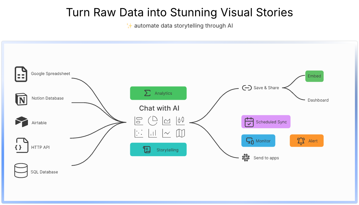
What sets Columns AI apart is its unique blend of artificial intelligence and user-friendly design, allowing anyone to turn spreadsheets and databases into professional-grade visual content. The platform is designed to work with tools already familiar to most professionals, such as Google Sheets, Notion, Airtable, Excel, and SQL. By connecting to these sources, users can instantly query and visualize their data using simple, natural language commands.
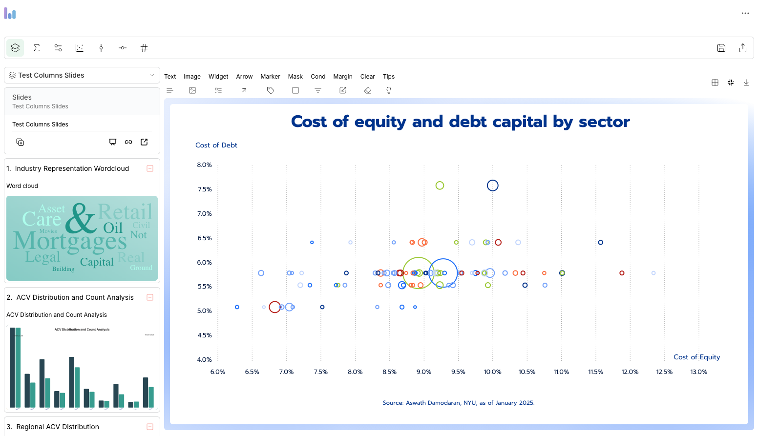
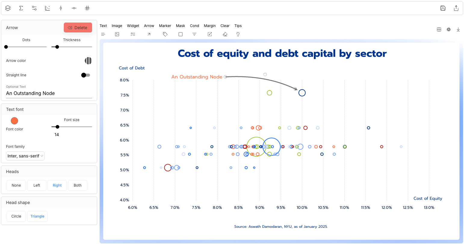
Instead of having to learn complex BI dashboards or write code, users describe what they want to see. The AI then suggests the most appropriate charts, graphs, or dashboards. From trend lines to comparisons to custom annotations, Columns AI automates the design and logic behind the scenes. This enables users to create and iterate on insights far more quickly than traditional workflows allow. The platform also supports custom filters, grouped views, dynamic updates, and a variety of chart formats that cater to both analytical depth and presentation polish.
Making It Easy to Share and Present Your Findings
Once data has been visualized, Columns AI offers powerful tools to share those insights across channels and teams. Users can export charts as high-resolution images, share interactive dashboards with password-protected links, or embed them directly into websites, newsletters, and reports. This makes it easy for professionals to turn their charts into assets for collaboration or communication.
Another standout feature is the Story Decks functionality. Users can create narrative sequences, combining multiple charts with explanatory text and transitions, much like a presentation. This is especially useful for consultants, analysts, or team leads who need to walk stakeholders through a set of data-driven recommendations. By reducing the need for PowerPoint slides or external design tools, Columns AI saves time while keeping presentations visually coherent and engaging.
According to Research.com’s Column AI review, this frictionless approach to sharing is a major contributor to the platform’s success. In a business world that runs on communication, the ability to explain and visualize data clearly, without delay or complexity, is a critical advantage.
Built for Productivity, Designed for Clarity
Columns AI combines technical sophistication with a highly intuitive user experience. Its AI assistant allows users to explore data conversationally, uncovering trends, outliers, and questions they might not have thought to ask. Users can ask things like “What was our best-performing campaign last month?” or “Compare revenue between Q1 and Q2,” and receive instant visual responses that are both accurate and presentation-ready.
Visual outputs are highly customizable. Users can choose from professionally designed templates or tweak chart colors, fonts, and layouts to match their brand. Each output is optimized for web and mobile viewing, ensuring consistency across devices and screen sizes. Columns AI also supports scheduled refreshes, so recurring dashboards update automatically without manual input. These features combine to create a seamless experience for both the creator and the audience.
Research.com praised Columns AI’s emphasis on accessibility and clarity. Unlike traditional BI tools that require heavy configuration or technical onboarding, Columns AI is easy to adopt. Its clean interface, intelligent suggestions, and robust export options make it suitable for both individual professionals and enterprise teams alike.
Trusted by Thousands Worldwide
Columns AI now serves over 12,000 users in more than 90 countries. Its global growth reflects the increasing need for simple, scalable tools that help people make sense of their data and share it with impact. The platform is used across a wide range of industries, including SaaS, e-commerce, education, healthcare, and consulting. Teams use it for everything from internal KPI dashboards to external investor updates.
What makes this adoption especially notable is that Columns AI appeals to users who aren’t necessarily data scientists or developers. Designers, content creators, marketers, and founders all benefit from the platform’s ability to turn data into visual communication, without the typical barriers of complex tools or steep learning curves.
Support is another area where Columns AI shines. The company offers a hands-on approach that includes in-app guidance, documentation, video tutorials, and direct customer support. Users can quickly find answers to questions and stay productive even when tackling complex data tasks.
Looking Ahead: Innovation Backed by User Needs
With its recognition by Research.com, Columns AI continues to invest in the future of intelligent, accessible data storytelling. The platform has several updates on the roadmap, including more chart types, smarter auto-labeling, deeper integration with Figma for design workflows, and enhancements for accessibility compliance. These features aim to support not just data professionals but also broader teams that depend on timely, clear insights.
The team behind Columns AI is focused on listening to users and building features that meet their evolving needs. Whether that means easier report generation, improved mobile experience, or tighter security controls for enterprise teams, the product is constantly adapting. This forward-looking mindset ensures that Columns AI will remain relevant and useful as the role of data continues to grow in all aspects of business.
A New Standard in Data Storytelling
In conclusion, being recognized by Research.com is more than a badge of honor. It validates Columns AI’s commitment to making data communication faster, clearer, and more effective for everyone. Whether you're running a startup, leading a product team, analyzing customer behavior, or preparing quarterly reports, Columns AI helps you do your work with greater confidence and clarity.
In a world where data is everywhere but understanding is often limited, Columns AI delivers the missing link. It transforms numbers into narratives, turning analysis into action. And now, with the backing of one of the industry’s most trusted directories, it stands as one of the leading tools redefining how modern businesses work with data.

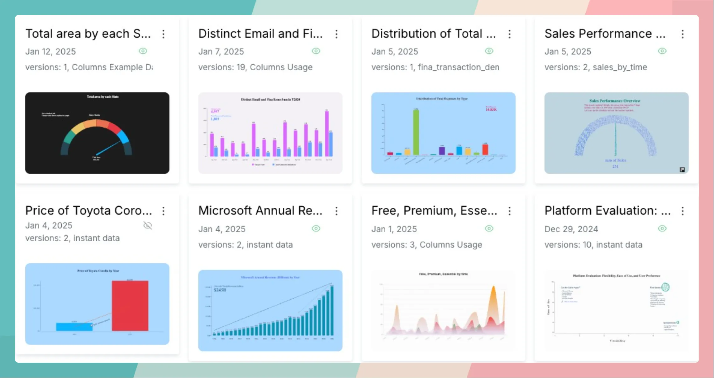

 Photo by fauxels | Source: Pexels
 Source: Unsplash