Mastering Data Visualization: Common Charts and Their Variants

We all love a good visualization — one that turns raw data into clear, compelling insights. Over time, people have invented countless chart types to help communicate ideas more effectively and make data more impactful.
Despite the variety, a handful of charts have become the go-to choices, so common that nearly every data or presentation tool makes them easy to create.
Today, let’s take a tour through these essential charts, explore their key variants, and see how they shine in different scenarios.
Bar Chart
The bar chart is arguably the most widely used visualization, presenting one or more metrics segmented by a set of categories. Its simplicity and clarity make it a go-to choice for comparing values at a glance.
In this section, we’ll explore different bar chart variants using a simple dataset, demonstrating when and why to choose each one.
Grocery Sales — Unit: Thousand Dollars
A common default bar chart:
Total Value Segmented by Combined Product & Label
Variant 1: Pivoting by a Single Dimension
When working with multiple dimensions, one approach is to combine them into unique category pairs, helping identify which combination holds the most value, as seen in the previous chart.
However, pivoting offers a more structured way to analyze data by breaking it down into a multi-level hierarchy. By pivoting on a specific dimension, we can dive deeper into value distributions within each group. For example, if we pivot by “label,” we gain insight into how different products perform within each label category, revealing patterns that might otherwise be overlooked.
Product Sales Pivoted by Label
In a pivoted view, each group contains multiple subcategories, which can quickly lead to a cluttered chart, especially when dealing with many keys. To address this, stacked bar charts provide an effective way to conserve space while maintaining readability.
By stacking values within each group, we can compare both the total size of a category and its internal distribution at a glance. This is particularly useful when we want to highlight the proportion of subcategories within each main category without overwhelming the viewer with too many separate bars. However, stacked bars work best when precise individual comparisons aren’t the primary focus — otherwise, grouped bar charts might be a better choice.
Product Stack Pivoted by Label
Variant 2: Comparing Against a Standard Threshold
Standard bar charts highlight value differences through bar length, making it easy to spot outliers — whether exceptionally high or low. However, in some cases, we’re less interested in raw differences and more focused on how each value compares to a defined benchmark.
A common reference point for comparison is the average value. By overlaying an average line or using color coding, we can instantly distinguish which categories perform above or below this standard. This separation helps quickly convey the positive and negative impact of different products, making it easier to identify strengths and areas for improvement at a glance.
Product Sales Compared to Average Sales
Variant 3: Percentage View with Highlights
Seeing absolute values — like total sales per product — is useful, but when we want to understand each product’s contribution to the whole, a percentage view provides a much clearer picture.
In this variant, we transform the standard bar chart into a percentage-based view, showing how much each product contributes relative to the total. To enhance clarity, we can highlight the largest contributor, making it easy to identify the most impactful product at a glance. This approach is particularly effective when emphasizing proportions rather than raw numbers.
Product Sales Percentage of All with Strawberry Highlighted
Line Chart
Line charts are just as popular as bar charts, especially when it comes to displaying trends over a sequence of values — most commonly, time series data. Their smooth, connected points make it easy to spot patterns, fluctuations, and overall direction at a glance.
In this section, we’ll explore the standard line chart along with its key variants, using the dataset below to illustrate their unique advantages.
Apple and Pear Sales by Month
A common default line chart:
Sales Trend for Apple and Pear
Variant 1: Using an Area Chart for Stronger Visual Impact
An area chart is a stylistic variant of the traditional line chart, maintaining the same underlying structure but enhancing visual emphasis. By shading the area beneath the line, this format creates a stronger sense of magnitude, making trends feel more tangible and impactful.
This approach is particularly effective when highlighting growth trends, cumulative data, or total volume over time. The filled area naturally draws the eye, reinforcing the scale of change more effectively than a simple line. For instance, when visualizing revenue growth, user adoption, or market share expansion, an area chart can make the upward momentum feel more pronounced, leaving a lasting impression on the audience.
Area Chart Shows Volume Trending Up
Variant 2: Threshold Split
In a threshold split, we introduce a goal or benchmark to a line chart, essentially dividing the graph into two parts: one representing values above the target, and the other below. This is similar to comparing against an average value in a bar chart, but with the added flexibility of setting your own specific threshold or target.
By incorporating this threshold, you can clearly demonstrate whether a target has been met, surpassed, or missed. For example, in this case, we can easily see that the monthly sales goal was reached in October, thanks to a notable spike in sales growth, visually highlighting this key milestone.
Threshold Split Indicates When Reaching Sales Goal
Variant 3: Accumulated View
An accumulated view is particularly useful when you want to track progress over time in terms of total achievement. It answers the question, “How much have I achieved so far?” by summing the values up to each point in the series.
As the data accumulates, the line reflects the cumulative total at every time interval, providing a clear picture of overall growth or decline. This variant is ideal for visualizing trends like total revenue, cumulative sales, or progress toward a goal, where the focus is on the accumulation of value over time rather than individual fluctuations.
Accumulated View Tells How Much Sales Made “So Far”
Pie Chart
Pie charts are a popular tool for displaying how a whole is divided into parts, with each slice representing a percentage of the total. Their simplicity makes them a go-to choice for illustrating proportional relationships.
However, the traditional pie chart can sometimes feel a bit monotonous, leading to the creation of various variants that aim to present the distribution in a more visually engaging way or provide clearer insights.
In this section, we’ll explore different pie chart variants using the dataset below, highlighting their unique advantages for visual storytelling.
Candidates and Votes
A common default pie chart:
Pie Chart Shows Votes by Candidate
Variant 1: Polarized Pie Chart
A polarized pie chart takes a unique approach by using the radius of each slice to represent its value, rather than the traditional angle. Essentially, this transforms the pie chart into a circular bar chart, where the size of each slice is determined by its distance from the center, rather than its angular extent.
This variant offers a fresh visual perspective, making it easier to compare values, especially when the differences between slices are subtle. The clear radial scale helps emphasize the size of each category, and its circular nature can still convey a sense of proportion, while providing a more modern and dynamic look compared to a traditional pie chart.
Polarized Pie Chart = Circular Bar Chart
Variant 2: Semi-Circled Pie Chart
The semi-circled pie chart is a purely visual enhancement, where the traditional 360-degree pie is replaced by a 180-degree arc, effectively using the top half of the circle to display the data.
This adjustment offers several benefits: it saves space beneath the chart, allowing room for additional textual information or annotations. It also makes the labels on each slice easier to read, since they are positioned more directly alongside the chart, reducing the clutter and improving clarity. This variant is particularly useful when you want to balance clear data visualization with ample space for supplementary details.
Semi-Circled Pie Chart Improves Readability of Pie Chart
Map Chart
Map charts are specifically designed to display geographic information, illustrating how values are distributed across different regions. While bar charts can sometimes be used for similar purposes, map charts have the unique advantage of visually connecting the data to a location, making it easier for the audience to understand the context.
The U.S. map and world map are two of the most commonly used types for geographic data visualization. In this section, we’ll explore various map chart variants, using relevant data to showcase their unique features and how they enhance geographic storytelling.
GDP in Billions by Top 10 Countries
A common world map visualization:
GDP Ranked by Color Depth
Variant 1: Bubble or Spike Map
In a standard map chart, color depth is often used to represent value differences, with a gradient color palette indicating increasing values as the color darkens. However, sometimes using sized shapes provides a clearer and more intuitive way to visualize these differences.
In a bubble map, each data point is represented by a circle, with its size corresponding to the value it represents. Similarly, a spike map uses vertical spikes or bars to show the same information, with the height of each spike indicating the value. These approaches make it easier to compare values across regions at a glance, as the size of the shape offers an immediate visual cue for relative magnitude.
Buble or Spike Map Uses Shape Size for Value
Variant 2: Choropleth U.S. Map
A choropleth U.S. map visualizes data by applying color coding to different regions, such as states, based on their respective values. To create this type of map, we simply need to provide a dataset with values assigned to each state, either by name or code.
This approach allows for a clear, region-by-region comparison, with color gradients helping to highlight areas of higher or lower values, making it easy to spot trends and patterns across the country.
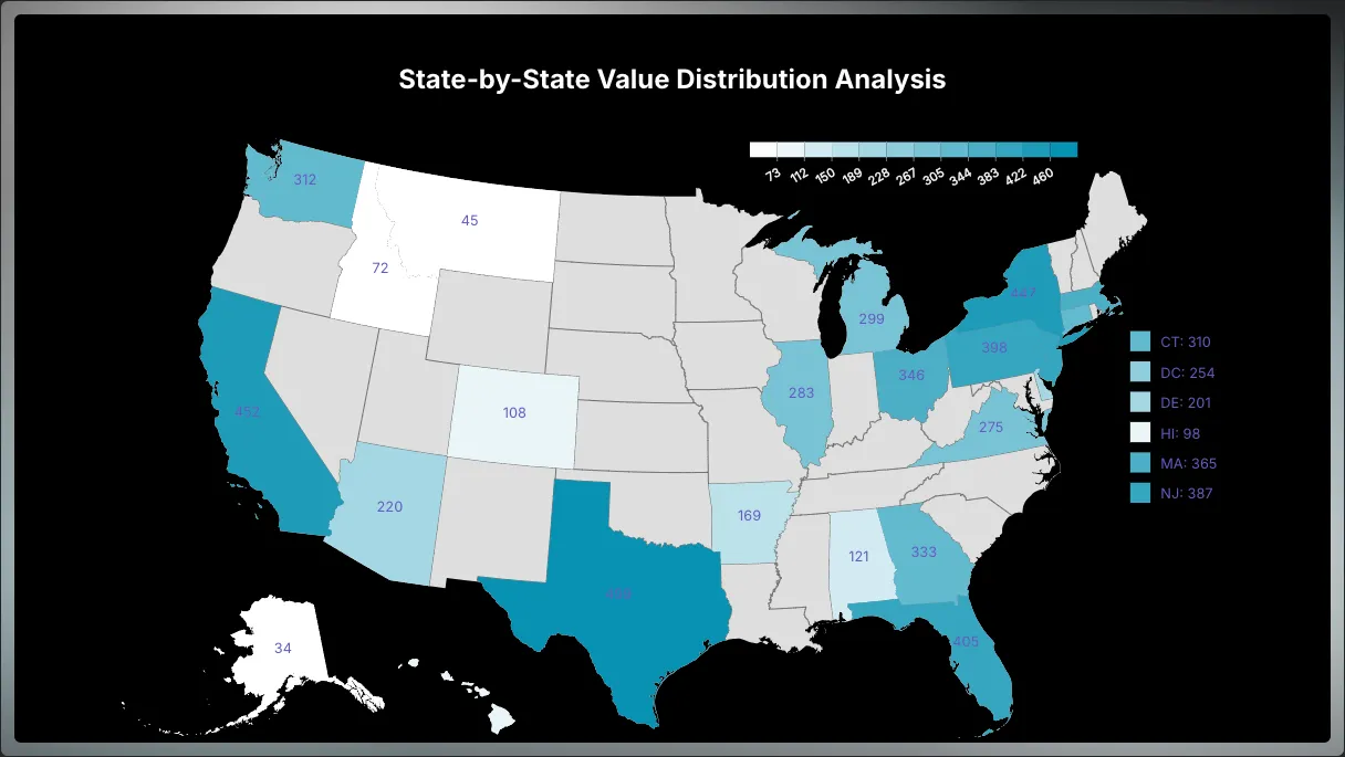 US Map Shows Value by State
Radar Chart
In the pie chart section, we compared a polarized pie chart to a circular bar chart. Similarly, a radar chart can be thought of as a circular line chart. Instead of using a traditional axis to measure metric values, a radar chart employs a web-like structure as its context. The radius from the center represents the metric value, with the distance from the center indicating the magnitude of the value compared to others.
While radar charts don’t have as many variants as some other chart types, there are still a few stylistic adjustments that can be made. Let’s take a look at them here.
Radar Chart = Circular Line Chart On Web
Scatter Chart
At first glance, a scatter chart might seem similar to a line chart, as it displays data points as dots without connecting lines. However, it serves a very different purpose. The main goal of a scatter chart is to illustrate the relationship between two metrics.
By plotting values on the X and Y axes, a scatter chart makes it easy to identify patterns or correlations, showing how one variable changes in relation to the other. This allows you to quickly assess trends, outliers, or clusters in the data.
Here’s an example dataset to create a scatter plot:
Average Height and Weight by Race and Rank on Size
In this example, we’ll explore how weight relates to height. A default scatter plot for this dataset would look like this:
Relationship between Weight and Height, Sized by Rank
Word Cloud Chart
A word cloud chart is a straightforward way to visualize word frequency from a collection of text data. It highlights the most frequently used words by displaying them in varying sizes — larger words indicate higher frequency. This type of visualization is especially useful for survey data, allowing us to quickly identify key themes or common terms mentioned by the audience.
While word clouds don’t have many functional variants, there are several stylistic options available to adjust the appearance and layout.
Here is one quick example:
Word Cloud Shows Word Frequency
Gauge Chart
A gauge chart is one of the simplest types of visualizations, as it displays a single value in relation to a predefined range. It’s often used to show how far a particular value has progressed toward a target or goal.
For example:
Gauge Chart Shows Progress Toward a Goal
By defining a range, we can create a gauge chart that functions much like the display on a car dashboard, showing where a value falls within a set range.
Performance Gauge Displays Single Value on Given Ranges
Summary
There are countless visualization types available, but the key to telling a compelling story with your data is choosing the right visualization first. This is essential to effectively communicate the insights you want to convey and ensure your audience absorbs the information quickly.
Start by selecting the appropriate visualization type for your data. Then, consider the variants within that type to find the one that best serves your story. If you’ve done that, you’re already halfway toward successful data storytelling. The next step is learning how to fine-tune your design using the right tools to enhance your presentation — striking a balance between simplicity and detail. A well-crafted, engaging visualization will make your story stand out.
All of the visualizations demonstrated in this post were created with Columns AI. Here’s a quick summary of the steps I follow to create them:
-
Prepare the Data: Start by either generating results through analysis or entering data via instant data types. This data set will drive your visualizations.
-
Choose Chart Type: Ask yourself, What do I want my audience to understand? Are you comparing categories? Tracking trends? Showing distribution? Or illustrating relationships between different datasets? Use these questions to guide your chart selection.
-
Decide on Variants: Once you’ve chosen your chart type, think about which variants will best highlight your insights and design accordingly.
-
Theme: Colors and fonts are crucial in visualization. I often ask AI for theme suggestions based on the type of data, such as: “This is a voting dataset — what theme style would work best for voters?” or “I want a metallic light palette; can you suggest one?”
-
Decoration: Utilize tools like text annotations, thresholds, comparisons, and arrows to emphasize key points in your chart and help your audience focus on the most important takeaways.
-
Save and Share: Once you’re satisfied with the final visualization, save it and share it with your audience. If you’re curious about how to create any of the variants shown in this post, feel free to comment below! I’d be happy to provide links to more detailed walkthroughs for each type of chart demonstrated.
Appendix
P.S. I frequently turn to AI for assistance in designing styles. Here’s a screenshot of a recent conversation I had for inspiration —
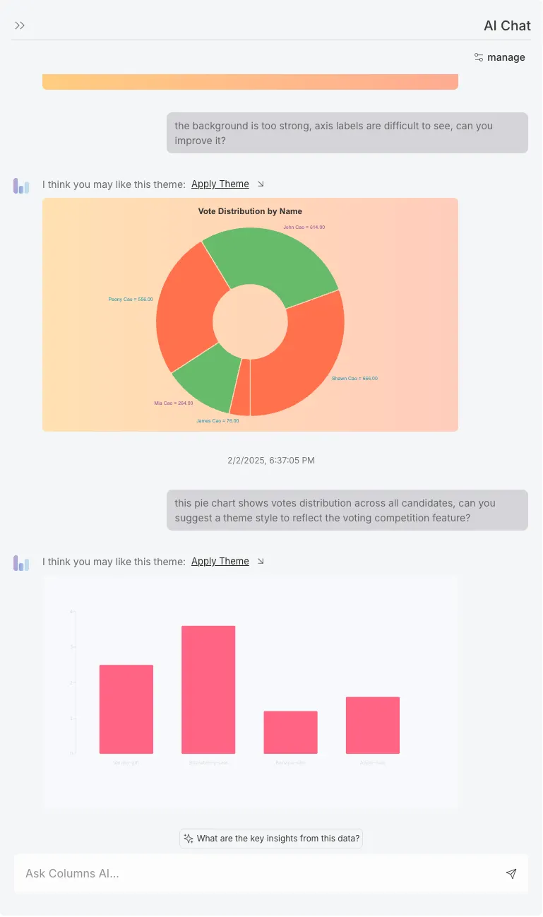 How I Ask AI Suggest Best Theme with Given Context
Note: this article was originally published on Medium.