
15 posts tagged with "Columns"

Everything about Columns product - features, updates and tips.

View All Tags

Mastering Data Visualization: Common Charts and Their Variants

· 13 min read
Shawn Cao
Founder & CEO

Head Image

We all love a good visualization — one that turns raw data into clear, compelling insights. Over time, people have invented countless chart types to help communicate ideas more effectively and make data more impactful.

Despite the variety, a handful of charts have become the go-to choices, so common that nearly every data or presentation tool makes them easy to create.

Today, let’s take a tour through these essential charts, explore their key variants, and see how they shine in different scenarios.

Recognition from Research.com

· 6 min read
Richard Dong
Data Scientist & Engineer

Columns Home

Columns AI, a fast-rising platform in the data visualization space, has earned a prestigious spot among top business software solutions, as recognized by Research.com.

This endorsement places Columns AI in the company of elite tools that help professionals work more efficiently, communicate better, and drive informed decisions with clarity and confidence. The recognition affirms Columns AI’s growing influence in the field of data storytelling, where speed, design, and accessibility are transforming how teams operate.

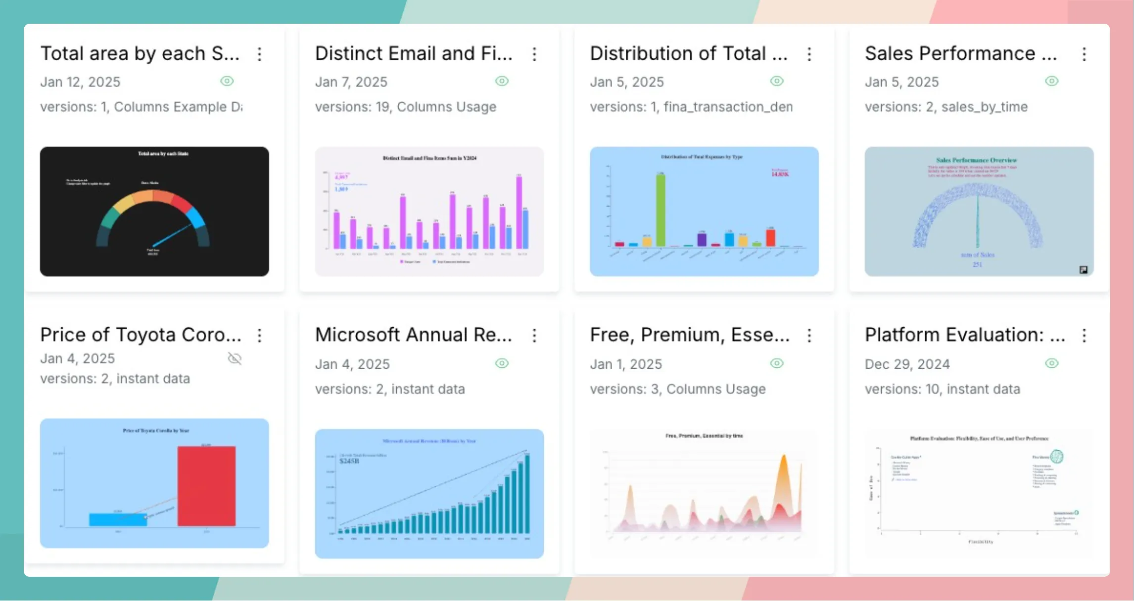
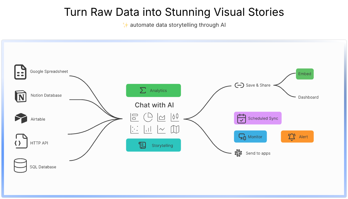
Known for its rigorous evaluation process and emphasis on real-world value, Research.com highlights only those platforms that demonstrate practical innovation and measurable impact. Its acknowledgment of Columns AI is a strong signal that the platform is not only technologically sound but also deeply aligned with the evolving needs of modern business users. Columns AI’s core mission—to help people convert data into compelling, easy-to-share visual stories—is resonating with professionals in marketing, product management, consulting, and beyond.

AI That Turns Raw Data Into Insightful Stories

What sets Columns AI apart is its unique blend of artificial intelligence and user-friendly design, allowing anyone to turn spreadsheets and databases into professional-grade visual content. The platform is designed to work with tools already familiar to most professionals, such as Google Sheets, Notion, Airtable, Excel, and SQL. By connecting to these sources, users can instantly query and visualize their data using simple, natural language commands.

Instead of having to learn complex BI dashboards or write code, users describe what they want to see. The AI then suggests the most appropriate charts, graphs, or dashboards. From trend lines to comparisons to custom annotations, Columns AI automates the design and logic behind the scenes. This enables users to create and iterate on insights far more quickly than traditional workflows allow. The platform also supports custom filters, grouped views, dynamic updates, and a variety of chart formats that cater to both analytical depth and presentation polish.

Columns Build

Making It Easy to Share and Present Your Findings

Once data has been visualized, Columns AI offers powerful tools to share those insights across channels and teams. Users can export charts as high-resolution images, share interactive dashboards with password-protected links, or embed them directly into websites, newsletters, and reports. This makes it easy for professionals to turn their charts into assets for collaboration or communication.

Another standout feature is the Story Decks functionality. Users can create narrative sequences, combining multiple charts with explanatory text and transitions, much like a presentation. This is especially useful for consultants, analysts, or team leads who need to walk stakeholders through a set of data-driven recommendations. By reducing the need for PowerPoint slides or external design tools, Columns AI saves time while keeping presentations visually coherent and engaging.

According to Research.com’s Column AI review, this frictionless approach to sharing is a major contributor to the platform’s success. In a business world that runs on communication, the ability to explain and visualize data clearly, without delay or complexity, is a critical advantage.

Built for Productivity, Designed for Clarity

Columns AI combines technical sophistication with a highly intuitive user experience. Its AI assistant allows users to explore data conversationally, uncovering trends, outliers, and questions they might not have thought to ask. Users can ask things like “What was our best-performing campaign last month?” or “Compare revenue between Q1 and Q2,” and receive instant visual responses that are both accurate and presentation-ready.

Visual outputs are highly customizable. Users can choose from professionally designed templates or tweak chart colors, fonts, and layouts to match their brand. Each output is optimized for web and mobile viewing, ensuring consistency across devices and screen sizes. Columns AI also supports scheduled refreshes, so recurring dashboards update automatically without manual input. These features combine to create a seamless experience for both the creator and the audience.

Research.com praised Columns AI’s emphasis on accessibility and clarity. Unlike traditional BI tools that require heavy configuration or technical onboarding, Columns AI is easy to adopt. Its clean interface, intelligent suggestions, and robust export options make it suitable for both individual professionals and enterprise teams alike.

Columns Design

Trusted by Thousands Worldwide

Columns AI now serves over 12,000 users in more than 90 countries. Its global growth reflects the increasing need for simple, scalable tools that help people make sense of their data and share it with impact. The platform is used across a wide range of industries, including SaaS, e-commerce, education, healthcare, and consulting. Teams use it for everything from internal KPI dashboards to external investor updates.

What makes this adoption especially notable is that Columns AI appeals to users who aren’t necessarily data scientists or developers. Designers, content creators, marketers, and founders all benefit from the platform’s ability to turn data into visual communication, without the typical barriers of complex tools or steep learning curves.

Support is another area where Columns AI shines. The company offers a hands-on approach that includes in-app guidance, documentation, video tutorials, and direct customer support. Users can quickly find answers to questions and stay productive even when tackling complex data tasks.

Looking Ahead: Innovation Backed by User Needs

With its recognition by Research.com, Columns AI continues to invest in the future of intelligent, accessible data storytelling. The platform has several updates on the roadmap, including more chart types, smarter auto-labeling, deeper integration with Figma for design workflows, and enhancements for accessibility compliance. These features aim to support not just data professionals but also broader teams that depend on timely, clear insights.

The team behind Columns AI is focused on listening to users and building features that meet their evolving needs. Whether that means easier report generation, improved mobile experience, or tighter security controls for enterprise teams, the product is constantly adapting. This forward-looking mindset ensures that Columns AI will remain relevant and useful as the role of data continues to grow in all aspects of business.

A New Standard in Data Storytelling

In conclusion, being recognized by Research.com is more than a badge of honor. It validates Columns AI’s commitment to making data communication faster, clearer, and more effective for everyone. Whether you're running a startup, leading a product team, analyzing customer behavior, or preparing quarterly reports, Columns AI helps you do your work with greater confidence and clarity.

In a world where data is everywhere but understanding is often limited, Columns AI delivers the missing link. It transforms numbers into narratives, turning analysis into action. And now, with the backing of one of the industry’s most trusted directories, it stands as one of the leading tools redefining how modern businesses work with data.

Fall updates

· 3 min read
Shawn Cao
Founder & CEO

Preface

Color Season

The rain has been pouring here for a few days, for Seattle, it means the beginning of the fall. I love Fall, it's the season of colors. In the morning, I feel so content walking with my daughter, on the soft yellow leaves toward the school, before the bell. That's even better if holding a warm cup of coffee, on the other hand.

I keep working on Columns because I want people to find the same beauty in their data.

Alright, here are our updates for September -

Airtable connection

· One min read
Shawn Cao
Founder & CEO

Airtable connection

Airtable is used by many people, and we are excited to announce that Columns now supports Airtable connection. Just simply connect your Airtable, and choose any table to be analyzed and visualized in Columns.

Build beautiful and insightful graphs with your Airtable data, and share with your team or the world. You can also set a schedule to keep it up with your Airtable data.

Check out the example demo we put on the homepage: [https://columns.ai/airtable](Columns + Airtable)

UX updates

· 2 min read
Shawn Cao
Founder & CEO

The AI storyteller

As we are planning Columns 2.0, we have fully embraced AI to help you tell a better story with your data. We are excited to share with you the first demo where Columns acts as a storyteller.

Build full loop with Notion

· 2 min read
Shawn Cao
Founder & CEO

The full loop with Notion

You may have tried Columns Notion integration Notion Integration to analyze and visualize your Notion database, but do you know what the full loop with Notion is?

It means, once you bridge Notion database with Columns, you can leverage a few functions to keep data and graph in sync with 0 effort. Let's dive into the details.

AI Design on Columns

· 3 min read
Shawn Cao
Founder & CEO

Columns Update April 2023

April has been great so far for Columns and our users, people find it more and more enjoyable at data storytelling, from insights discovery, and chart building, to presentation beautification.

At the beginning of the month, we announced Notion Integration where you can easily build two-way sync between your Notion database and Columns graphs. Today, I’d love to share some more exciting features that simplify your storytelling process further.

Embed a live story

· 5 min read
Shawn Cao
Founder & CEO

Embed a live data story in your blog

As a blog writer, do you dream about embedding a live data graph in your article? It shines your content to be more attractive and makes it much more digestible for your readers, also it makes it more worthwhile for your readers to share with others.

More importantly, what about if the data graph automatically updated, and you don't do anything to get the magic?

For example, current blog embeds a live interactive graph, as shown below (hover mouse over for tooltip):

Changes 2022/12/12

· 2 min read
Shawn Cao
Founder & CEO

Live Dashboard Release

Greetings!

Columns is a data storytelling platform, we have continued building storytelling technology for you to do better communication using your data. It is designed to meet these goals, if any of these fails for you, we owe more work to you:

  • Easy to discover and generate visual insights by data analysis.
  • Handy design tools to customize and style a data story.
  • Worry-free sharing with multiple communication methods.

In the last few months, we have received many user requests on building a dashboard. Columns is powered by its own big data computing infrastructure which serves large data set analysis, this distributed system is actually open-sourced, you can find it on GitHub if interested. With the advantage of this infrastructure, we can keep your visual stories in sync with your data.

So today, we introduce you Columns Live Dashboard.